Music Video:
For inspiration for my music video, I looked at some existing music videos to generate ideas. By researching into videos by artists such as Miguel and Frank Ocean, as well as videos for other songs by Janelle Monáe, it helped me to decide what the key features of this kind of music video are and whether to use or adapt and alter them. Alongside this, Pete Frazer also highlighted that: “Different genres of music produce slightly different visual conventions in music videos”, suggesting certain conventions were limited to this particular genre and would help me to create a product that would comfortably fit into Indie/PBR&B.

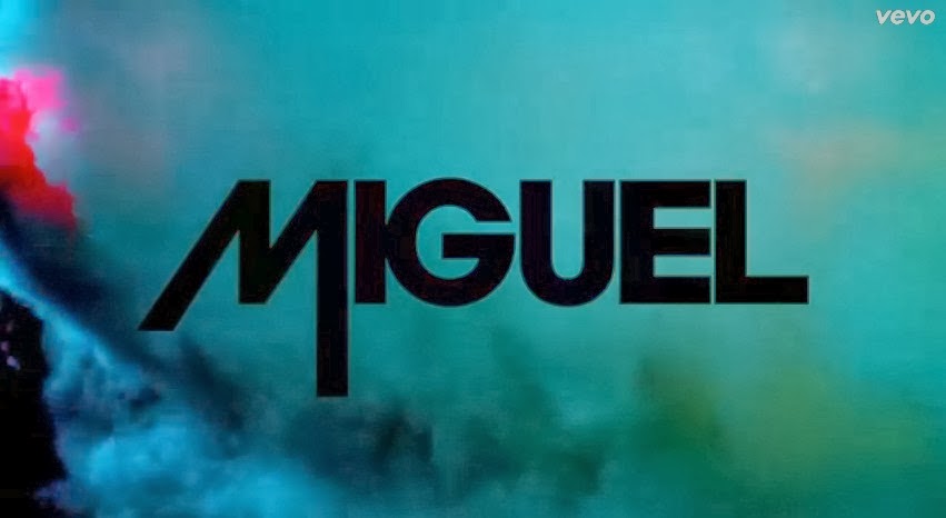 A common theme in Janelle's own videos is the 'Wondaland' logo appearing at the beginning of every video, a motif that is exclusive to her record label The Wondaland Arts Society, which she founded, and has become a part of her star image. I therefore decided to include this at the beginning of my video, before the music started, like in hers. I found a similar idea occurring when I looked at videos by Miguel, as they also featured his own 'logo' at the beginning, in the same font as on his albums.
When looking at the videos by other artists I used for research, it was made clear that the majority of the screen time was spent on the artist themselves; something which seemed necessary for my music video, and is something Andrew Goodwin theorized as being an important part of every music video, regardless of genre; as an artist as part of a record label, there is a need to include regular close ups of the artist and to develop a motif which would potentially recur across their work to build/reflect their star persona. The medium close ups themselves featured the star miming the lyrics to maintain performance (Pete Frazer), another common element associated with music videos, which was shown to be the key theme in all songs from this genre that I researched. The aesthetic of the music video was also greatly influenced by my research - the genre itself is commonly associated with a highly polished and sparse feel, with only basic elements involved, meaning that the video would have to be finished to a highly professional standard as it would not fit in with these themes.
This brings me neatly onto mise-en-scene. I ensured that the main star wore a costume that was, overall, clean and sharp, that would reflect the sorts of clothes that the audience would wear (blacks and whites, shirts, bow ties, brogue shoes, etc.) but that also looked natural in terms of make-up and hair styling. With the editing, I wanted to make it look clean by cutting the shots to the pace of the music (also linking back to Synaesthesia) demonstrating a sparse quality and stripping back any overly complex ideas. The location I chose also seemed to be typical of this genre, by having my performer dance and sing in front of a plain, basic white backgorund.
This genre, despite being one of generally set 'rules', if you like, does feature a large amount of variation between some songs and music videos. This allowed me to employ a certain amount of creativity into my music video, whilst still being redundant enough to suit these classic genre characteristics.
In making my music video, and by doing the research beforehand, it was clear to me that it should be about the balance between entropy and redundancy. On one hand, my video needed to have some suggestion of repeated concepts, perhaps inspired from other videos (helped by the preliminary research), in order to set up a "framework of comprehension” (Tom Ryall). It can be beneficial to audiences, producers and their music to exploit these already established genre conventions; as an audience, one takes pleasure in identifying with repeated elements, allowing the producers to thrive upon this for their benefit through any intertextual references to videos that adopt the same sense of style. On the other hand, as illustrated by Susan Hayward, “genre is never static, but shifting and slippery.” Although going against templates can pose an economic risk and alienate the audience through a lack of cohesion, including an element that they wouldn’t suspect can surprise them and become something from which they take pleasure, so long as it is correct doses, which is what I think I managed to do with my video.
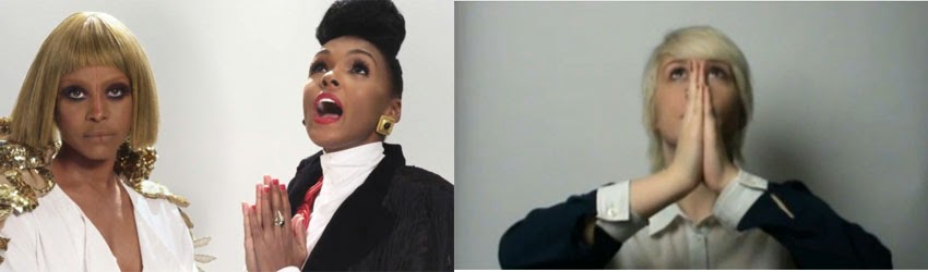 This element of challenging certain genre characteristics is shown in my somewhat lack of a noticeable narrative. Although I saw in other videos by
Janelle Monáe, as well as some by similar artists, that there wasn't a distinct narrative, I feel as though my video doesn't contain one at all.
Digipak & Advert:
Along with my music video, there were also key conventions that I needed to include in both my magazine advert and digipak, that had I discovered through conducting several pieces of research into existing pieces. By looking at album covers by artists like Frank Ocean and Kanye West, as well as magazine adverts for the latter and Drake, it was clear that both needed to be kept relatively simple and minimalist, whilst still featuring elements of creativity.
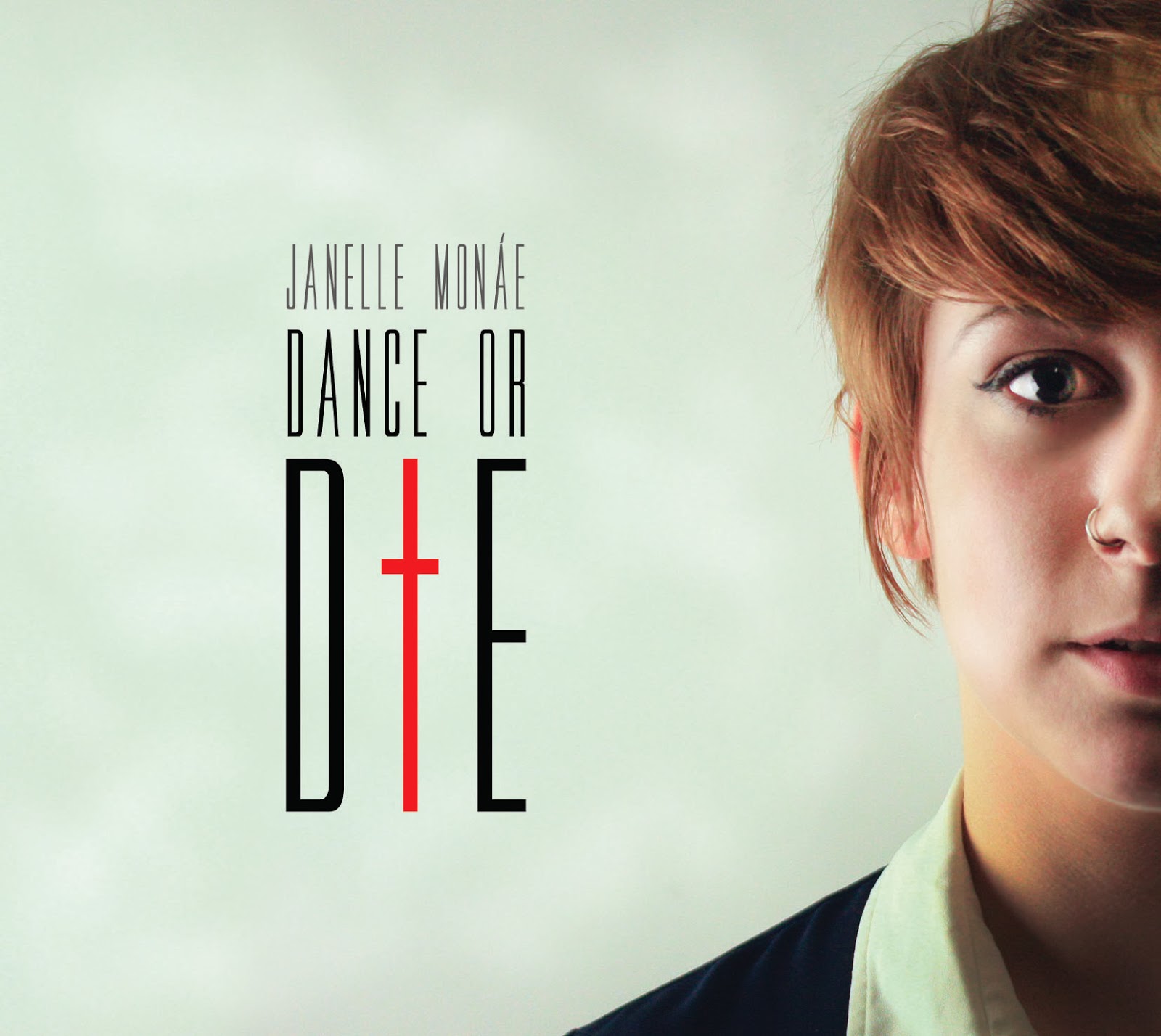
While looking at the album cover for Drake's album 'Nothing Was the Same', together with the magazine advert, I noticed that the same images and exact same theme was used, suggesting a sense of coherency between the two, making one identifiable to the other - you see either of them separately and know they're both for the same product. For my advert and album cover, I used image
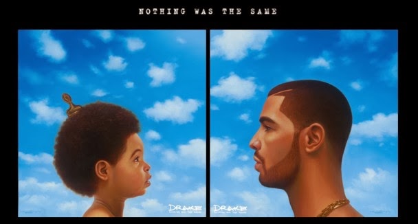 s that were relatively similar and used the same filters and editing style on them, in order to make them look sharp and clean – an appearance that the audience would appreciate and recognise. This theme continued with the lack of bright colours, apart from the use of the red for the cross in the word 'DIE'. For the digipak, I included typical features like a barcode on the rear of the casing, the name of the album and artist on the spine and the track titles on the back.

This element of challenging certain genre characteristics is shown in my somewhat lack of a noticeable narrative. Although I saw in other videos by Janelle Monáe, as well as some by similar artists, that there wasn't a distinct narrative, I feel as though my video doesn't contain one at all.
Digipak & Advert:
Along with my music video, there were also key conventions that I needed to include in both my magazine advert and digipak, that had I discovered through conducting several pieces of research into existing pieces. By looking at album covers by artists like Frank Ocean and Kanye West, as well as magazine adverts for the latter and Drake, it was clear that both needed to be kept relatively simple and minimalist, whilst still featuring elements of creativity.
While looking at the album cover for Drake's album 'Nothing Was the Same', together with the magazine advert, I noticed that the same images and exact same theme was used, suggesting a sense of coherency between the two, making one identifiable to the other - you see either of them separately and know they're both for the same product. For my advert and album cover, I used image
s that were relatively similar and used the same filters and editing style on them, in order to make them look sharp and clean – an appearance that the audience would appreciate and recognise. This theme continued with the lack of bright colours, apart from the use of the red for the cross in the word 'DIE'. For the digipak, I included typical features like a barcode on the rear of the casing, the name of the album and artist on the spine and the track titles on the back.
I also added typical features that were on almost all of the existing adverts that I looked at, such as star ratings, the release date, and the formats that the album was available in (advertisements for Amazon, iTunes, etc.). With regards to mise-en-scene, I used the same model and location for both pieces.
No comments:
Post a Comment